10
Interviews
3
User personas
3
UI subtractions
4
Key takeaways
Designing for the Wrong User
Ravago is a global leader in plastics distribution. Its digital platform is a product catalog for business customers sourcing raw plastic materials. And for the first time, it was about to show real prices.
A new feature was on the table: small-lot orders with direct, fixed pricing. Price, lead time, and availability data would surface on the platform for the first time. Previously, all of that lived buried inside a quote-request flow.
The team had already moved into solution space: information-dense card layouts.
I paused the process and asked one question: who are we designing for?
The assumption was engineers. Nobody had validated it.
Finding the user without meeting them
Analytics tools like Clarity showed us what users did, but not who they were or why they decided anything. Without knowing the actual audience, every design decision was a guess.
There was a second problem: direct access to platform users wasn’t possible. The platform was new, usage was limited, and customers had no relationship with the platform team. Their touchpoint was the sales organization.
So instead of interviewing customers, I interviewed the people who talk to them every day: sellers. Ten interviews, one hour each.
The critical reframe: I didn’t ask sellers what they wanted from the platform. I asked what customers were requesting from them.
That one shift turned sales conversations into a proxy for user research.
Engineers weren’t the user
The research revealed a clear user hierarchy, and it wasn’t what anyone expected.
The most frequent catalog visitor. Price-driven, high urgency, and functions as an internal relay for the rest of their company. | |
Typical at smaller companies. One person wearing multiple roles, combining price sensitivity with technical interest. | |
Validates technical feasibility after the Purchaser has done the initial sourcing. Needs detailed specs and TDS documents. |
Engineers were not the primary users. Purchasers were. The original design direction was invalidated entirely.
The research also mapped three customer journeys (new product sourcing, product validation, alternative search) and uncovered the real workflow hiding underneath:
Purchasers filter, shortlist up to five products on a comparison page, and hand that off to the Engineer.
This detail changed everything about the card. If every product shown after filtering already meets the applied criteria, the card doesn’t need to display feature values at all.
Subtraction as a design decision
The existing card was filled with noise that served neither Purchasers nor Engineers.
Vague Feature Labels
Product Images
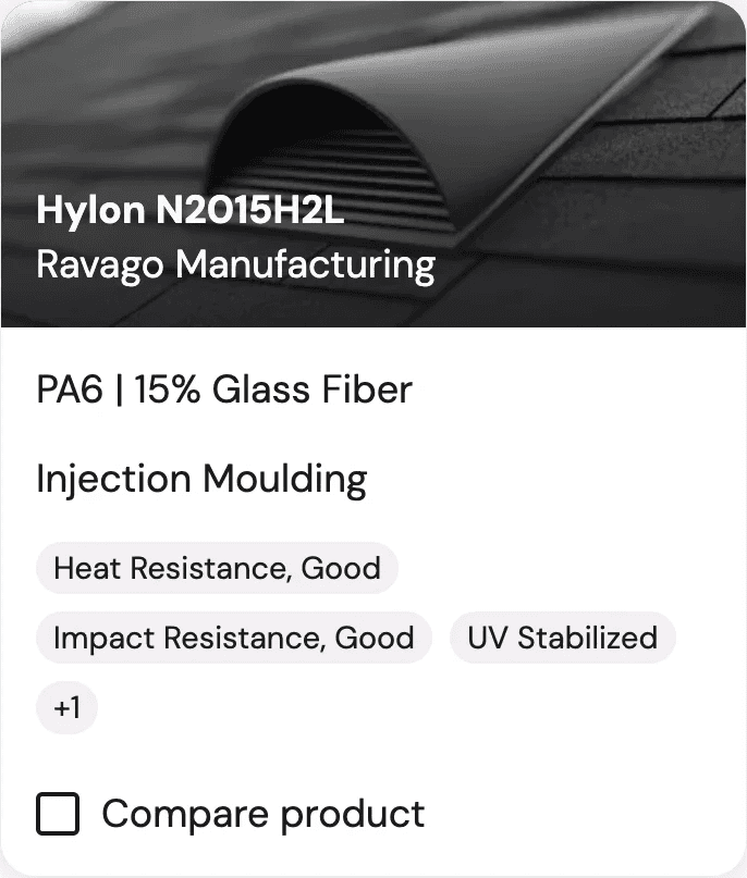
Not always informative
Ravago's current card design
One idea floating around: dynamically display the feature values matching the active filters on each card. On paper, clever. In practice, visual chaos: cards showing inconsistent content depending on filter state, plus a multi-language maintenance burden.
My job as a designer here was to subtract, not to add.
Product images. | |
Vague feature labels | |
Filter hierarchy |
The three things that actually matter
With the small-lot feature, three critical data points were becoming available for the first time. The research confirmed their importance and defined how each should be presented.
Price. The primary decision driver. The design challenge: display it for small lots without undermining volume negotiations. Transparency, balanced against commercial flexibility.
Lead time. Purchasers operate under extreme urgency. “1 week” is acceptable. “30 weeks” eliminates a product instantly.
Availability. “Is this in stock? When is restock?” Availability transparency directly impacts conversion.
One unexpected finding: the Recycled label caused negative sentiment. Customers expected recycled material to be cheaper. When quotes came back higher, it created friction.
The recommendation: treat sustainability as a specification, not a selling point.
The Digital Seller
The research surfaced a strategic direction bigger than one card: the platform should function as a “Digital Seller”, not a fully autonomous marketplace.
The personal expertise of sellers is a crucial differentiator. The goal is to automate low-value tasks while preserving that relationship.
The redesigned card strips away the noise and surfaces what actually drives decisions:
Price: a “Starting From” price for small lots, with a clear pathway for larger volumes
Lead time: accurate delivery timeframes, surfacing a competitive advantage
Availability: stock status with restock dates
Additional MVP elements: MOQ display (a competitive advantage in itself), a clear CTA for volume pricing, and the removal of all vague feature labels and undifferentiated product images.
Impact
The redesign eliminated the primary friction point in product discovery by designing directly for price, lead time, and availability.
It surfaced one of Ravago’s competitive edges, fast delivery, in the digital storefront for the first time. Previously, it was invisible to customers.
The card now matches the actual user’s mental model: transaction-first for Purchasers, not feature-first for Engineers.
Beyond the card itself:
A validated user hierarchy (Purchaser → Multi-Hat → Engineer) now informs all future platform decisions
“Digital Seller” was adopted as the guiding vision for platform development
The research surfaced a strategic roadmap: ultra-shareable PDPs for one-click Purchaser-to-Engineer handoff, a digital sample follow-up system to prevent leads dying post-RFS, and price nudging mechanisms to accelerate conversion
Takeaways
Challenge assumptions before designing. The team was building for engineers. The users were Purchasers. Without the research, the redesign would have optimized for the wrong audience entirely.
Indirect research can be just as revealing as direct. By interviewing sellers about customer conversations, not platform preferences, we uncovered the real decision drivers without ever needing direct user access.
People being interviewed have something to protect. Design your questions around it. When a platform team shows up asking how your job works, it’s natural to wonder if that job is being automated away. Some answers will quietly upsell a person’s importance, or make processes sound more complex than they are. The way through: ask for direct stories, not direct questions. “Tell me about the last time a customer asked you about pricing” puts someone back inside a real moment, reliving it as it happened. There’s no room to shape the narrative. Opinions can be curated. Stories are far more truthful.
Author’s note
This case study covers one facet of my work at Ravago. The product catalog redesign sits within a broader scope of enterprise B2B platform design, research operations, and cross-functional collaboration. Additional case studies covering other projects and domains will follow.